Edvard Munch, the Norwegian painter best known for his iconic work The Scream, left an indelible mark on the art world with his unique use of color. Munch was not just a master of capturing emotion through form; he utilized color as a powerful tool conveying psychological depth and narrative. Munch was deeply influenced by the Symbolist movement, which emphasized the emotional and psychological over the literal. He believed that color communicates feelings that words cannot express. Let’s look at how Edvard Munch influenced our emotions with color.
Color Psychology: the Emotional Language of Color
Before delving into Munch’s artwork, let’s understand the basics of color psychology. Color psychology is the study of how colors influence human behavior and feelings. Research shows there is a direct relationship between color and emotion, ie, different colors evoke various emotional responses. Here’s a brief overview:
Red: Passion, anger, excitement
Blue: Calmness, sadness, stability
Yellow: Happiness, warmth, energy
Green: Nature, tranquility, growth
Purple: Luxury, mystery, spirituality
Black: Power, elegance, mourning
White: Purity, simplicity, peace
These associations vary across cultures, but the fundamental connection between color and emotion remains universal.
How Edvard Munch Influenced Our Emotions With Color
Munch’s palette is characterized by reds, blues, greens, and yellows creating dramatic contrasts and highlighting emotional turmoil or joy. In contrast, he subdued these same colors when depicting melancholy and depression. He carefully chose each color reflecting the inner psychological state of his subjects.
The Scream, 1910
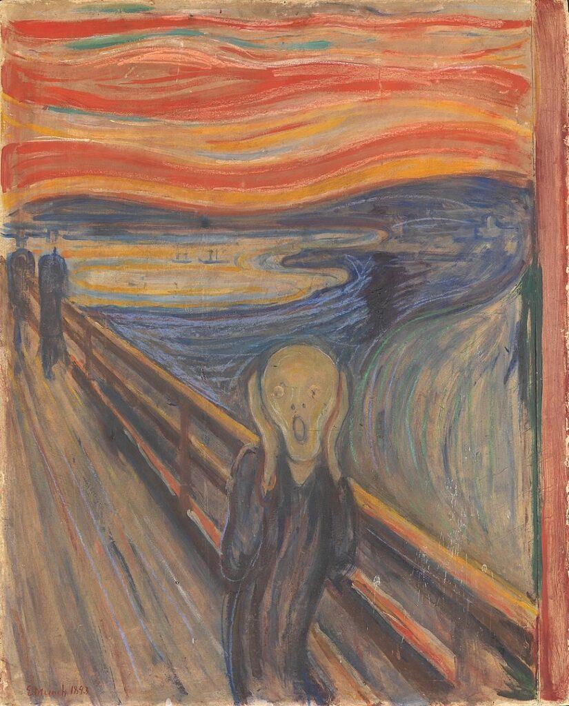
The Scream is a wonderful example of how color influences emotion. The calm of the blue is offset by the dynamic red, adding confusion, panic, and tension to the entire scene.
Melancholy, 1892
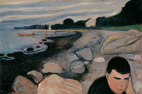
Shades of blue and neutral colors dominate Melancholy. All the colors in this piece are subdued. Together with the very dark shadows, we have a feeling of quiet depression and despair.
The Haymaker, 1917
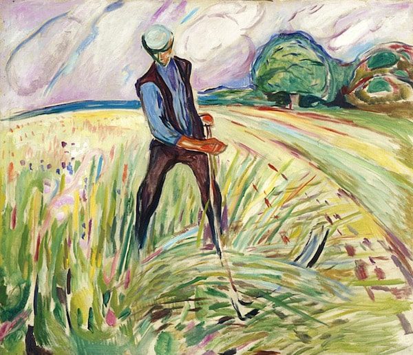
In The Haymaker, Munch departs from tension and excitement to a tranquil scene of a harvester calmly moving his scythe over a field of hay. The dominant colors of analogous bold colors of blue and green produce a serene feeling, while the yellow adds the warmth of a sunny day.
Death in the Sickroom, 1893
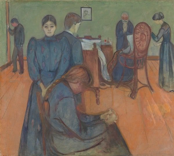
A simple palette of blue, red, and green, comprise Death in the Sickroom. Normally the complementary colors of red and green together create excitement and energy. However, Munch desaturates these colors, giving us a quiet and somber mood.
The Apple Tree, 1920
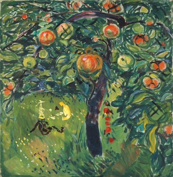
In The Apple Tree, Munch uses the same colors of red, green, and blue as in Death in the Sickroom. However, these colors are now bold and vibrant, celebrating nature and the beautiful ripe apples hanging from the tree.
Children on the Crag, 1910
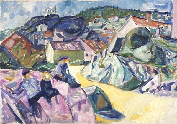
Filled with pastel-like colors of blue, purple, yellow, and a touch of red, Children on the Crag elicits a playful feeling of young children scrambling over the local rocks outside their village. Although not bold colors, the complementary purple-yellow, and red-green add vibrance.
Conclusion
Edvard Munch’s innovative use of color transformed his paintings into emotional experiences, leaving viewers captivated and introspective. In fact, the emotions in his scenes were so varied, that one might think several different artists created these paintings.
Colors are not just aesthetic choices in art; they hold the power to evoke emotions and tell stories. This influence shapes how we experience art, inviting us to engage on multiple levels. Next time you admire a piece of art, take a moment to consider its color palette and the powerful emotions it conveys. Examine how these hues resonate within you, transforming your view of art forever.
All Edvard Munch artwork shown here in the Public Domain.

More on art and color – Abstract Impressionism: A New Journey into Color and Emotion