Color in art evokes a wide range of psychological responses. The first thing we notice in a work of art are the colors, and it’s the colors that set the tone of the piece. From tranquility to agitation, anger, and every mood in between, we find ourselves emotionally involved in the art we look at. That’s why I plan my color schemes to fit the subject, and the mood I’d like my viewers to experience.
Bright Color Schemes
The Triadic Color Scheme
I use bright colors in my Jewish holiday art, evoking excitement. Two color palettes work best for this. The first uses the primary colors of red, blue, and yellow. These are pure colors, and naturally evoke a happy feeling. This is called a triadic color scheme.
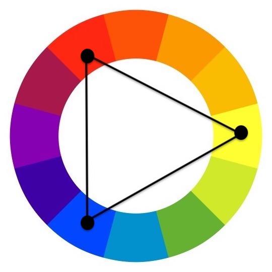
Three colors are evenly spaced on the color wheel in the triadic color scheme.
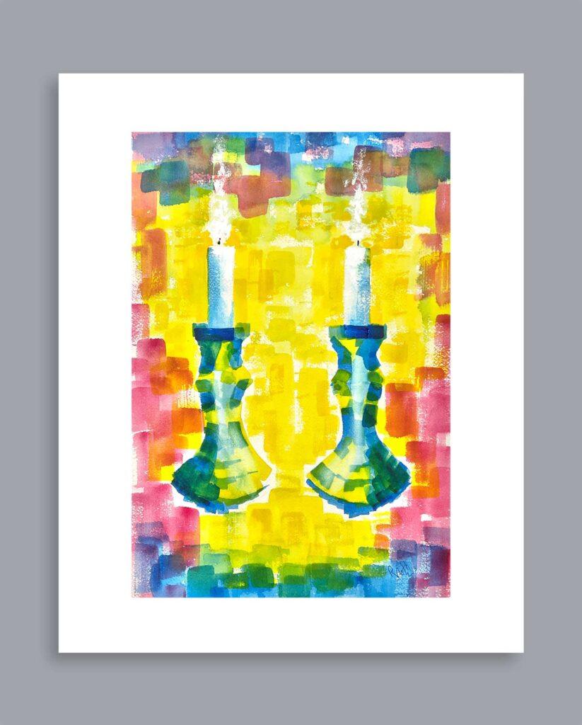
This depiction of lit Shabbat candles uses a triadic color palette of bold primary colors. There is also a touch of orange and green. Bright Shabbat Candles, watercolor, © Rhonda Roth, All Rights Reserved
The Tetradic Complementary Color Scheme Using 4 Colors
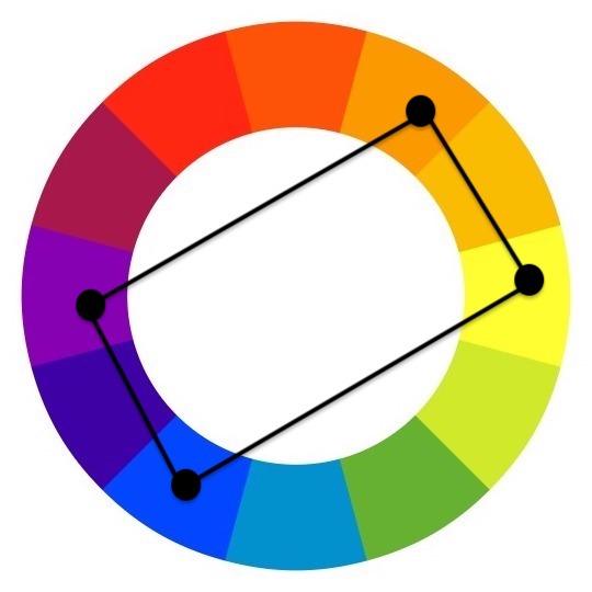
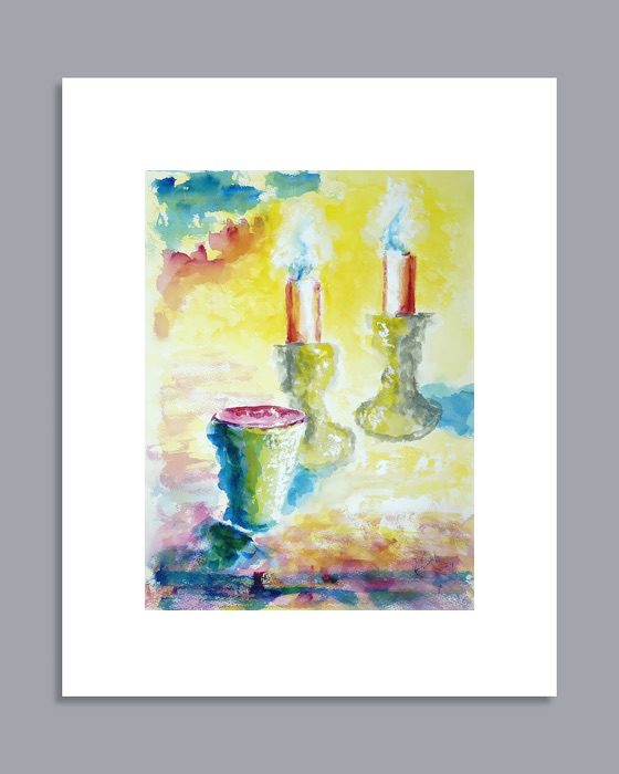
Another one of my favorite color schemes is the tetradic complementary. This color palette uses two colors plus their complement for a total of four colors. Complementary colors when placed together sometimes appear too intense. I like to lessen the saturation of my complementary colors by mixing in some gray.
Complementary colors sit opposite one another on the color wheel. Purple and yellow are complements, as are blue and orange.
This kiddush cup with Shabbat candles in the background uses a tetradic color palette using blue, orange, purple, and yellow. The intensity of the blue and orange is lessened and produces a calmer feeling. Kiddush Cup with Grape Decoration, watercolor, © Rhonda Roth, All Rights Reserved
The Complementary Color Scheme Using Two Colors
A truly eye-catching color scheme are two complementary colors side by side. My favorite is purple and yellow with blue added for a slight accent. I also like using blue and orange together with a yellow or green accent.
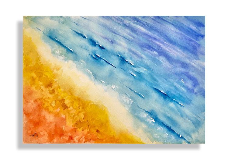
Here’s a seascape using blue and orange with a hint of yellow. Sea and Sand 2, watercolor, © Rhonda Roth, All Rights Reserved
The Calm, Analogous Color Scheme
The analogous color scheme consists of colors adjacent to each other on the color wheel. This color palette appears in nature, and I love to use it in my landscape and nature scenes. It evokes a calm, tranquil feeling.
The analogous color scheme has colors next to each other on the color wheel.
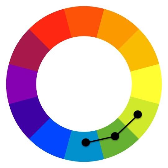
Blue, green, and yellow-green make up this pastel drawing of a frog in the reeds. Frog in the Reeds, chalk pastel stick, © Rhonda Roth, All Rights Reserved

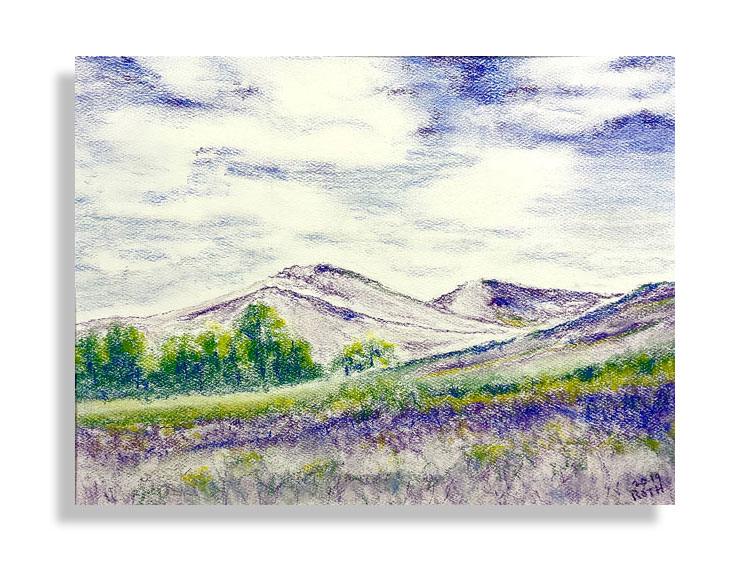
Here’s an analogous color scheme using purple, blue, and blue-green. Purple Hills, pastel pencil, © Rhonda Roth, All Rights Reserved
For additional information on the color wheel and other color schemes, visit my educational website The Drawing Process – a guide for the beginning artist.
These are my favorite color schemes – triadic using the primary colors, complementary and tetradic complementary either bold or muted, and analogous. I hope you enjoy looking at my artwork as much as I enjoy making it!
Discover more from Rhonda Roth Art
Subscribe to get the latest posts sent to your email.